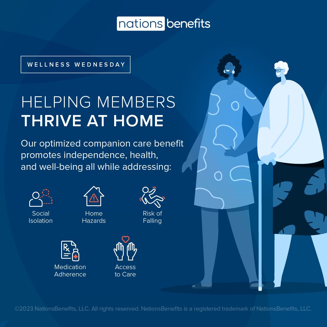
Colors
Our palettes unite our brand and allow us to express our personality. Consistency in the use of colors across all brand assets helps to build brand recognition.

Primary Color Palette
Brand colors play an essential role in establishing visual identity. Our primary color palette is sophisticated and clean, and evokes feelings of calm and support. These colors will help differentiate us from competitors and establish us as a brand that partners, providers, and members can trust.
Color Scale
Follow the color ratio below when designing materials. Aside from neutrals, Navy should be the dominant color. Coral may be used in moderation as an accent color.
Shades & Tints
These shades and tints based offer extra flexibility and variety in situations where using only Navy is not satisfactory. They are also applied in our pre-defined gradient swatches.
Use cases include, but are not limited to:
Illustrations
- Gradients
- Backgrounds
Gradients
Use our pre-defined gradients in backgrounds and illustrations.
Secondary Color Palette
Our secondary color palette allows for brand flexibility. These colors complement the primary colors and can add visual interest to standard design elements. The supporting palette should always be used in conjunction with the primary color palette and should never be used on its own.


