Logos & Usage
The NationsBenefits brandmarks are an important expression of our brand identity. By applying the brandmarks in a consistent manner, it strengthens the recognition & visibility of our brand.
Brandmarks
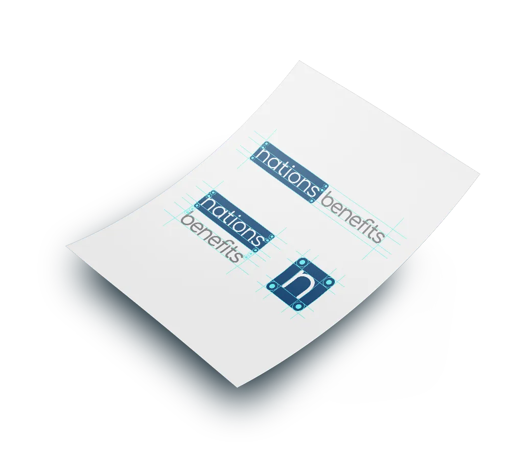
The most identifiable visual elements of our brand are our logos. They celebrate the equity and history of the Nations name in a way that is both contemporary and optimistic.
Wordmark
The wordmark “NationsBenefits” is a singular piece of artwork and should never be re-created or modified. When used in a sentence, always capitalize NationsBenefits and do not separate, e.g., “Nations Benefits”. The same is true for NationsHearing and NationsOTC.
Proper Usage
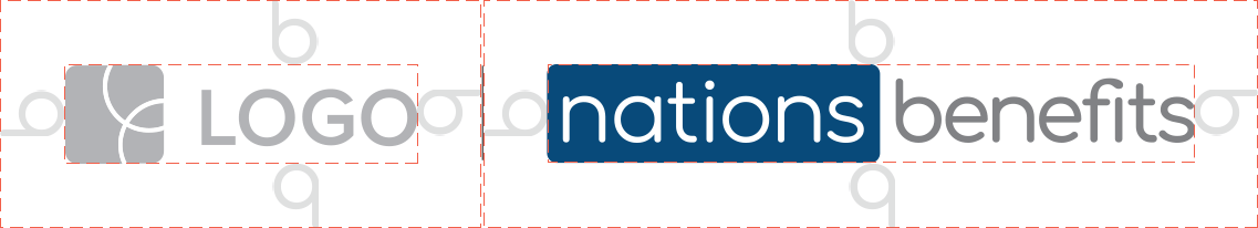
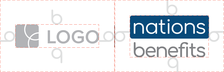
It is critical for the logos to be used appropriately to help maintain the integrity of the brand. The horizontal configuration is the preferred presentation of all brand logos. If space prohibits the use of the horizontal format, the stacked version may be used.
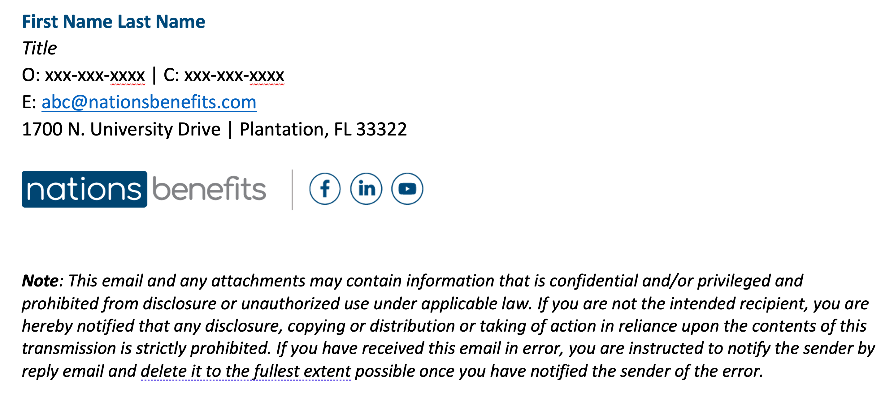
Email Signature
Email signatures are an important part of our branding. Every employee should use the same signature template to reinforce our brand image and build unity. Below is an example of the NationsBenefits signature.
To apply the signature, open the Outlook app. Under preferences, click “Signatures”.

Logo Colors
Our company logo uses two colors:
NationsBenefits Navy
- Steeple Gray
The consistent and proper use of these colors helps us build a strong and memorable brand.
Whenever possible, present the NationsBenefits logo in full color and in the horizontal format.
When the use of a full-color logo is not possible, the logo should be presented in black or white. The black version should be used on a white background. If the background color is black or another dark color, the logo should be presented in white (reverse) on the solid color background.
Always use the approved digital file formats.
Do not recreate the logo or manipulate it using graphic editing software.
Always consult with someone from the creative team if you have questions.
Use the tabs below to view the color variations for each brand:
Pantone Cool Gray 9 C
0.0.0.60 (Steeple Gray)
128.130.133 (Steeple Gray)
Pantone 7416 C (Coral)
0.72.66.0 (Coral)
242.96.74 (Coral)
Pantone 2905 C (Sky Blue)
47.1.2.0 (Sky Blue)
122.208.241 (Sky Blue)
Pantone 200 C (Chili Pepper)
0.100.76.13 (Chili Pepper)
186.12.47 (Chili Pepper)

Space, Size, & Cobranding
Clear Space
It is critical to maintain an open area surrounding the NationsBenefits logo so it remains recognizable and does not become lost in other page elements. Clear space is defined relative to the size of the logo, not as a border of a set distance (such as saying “1/4 inch”).
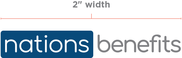
Minimum Size Requirements
To ensure legibility and accuracy, a minimum size has been set at 2" wide for the primary NationsBenefits and NationsHearing logos, and 1.6" for the NationsOTC logo.
Cobranding
Aligning with another logo: whenever partner/sponsor logos are present, a .25pt vertical, 100% black line must be placed between the NationsBenefits logo and the sponsor/partner logo. The length of the vertical line should be demonstrated as shown in the diagram in order for the most pleasing outcome, never to exceed the height of either logos.
Do Nots
To maintain brand integrity, the logos must always be presented clearly and accurately in all applications. Logos should never be distorted, manipulated or altered in any way.
Below are some examples of things to avoid when using our logos.
Do not do the following:
Use filters, effects or drop shadows of any kind
- Break the logos into individual words or stack them
- Manipulate the proportion of the logos, stretch them horizontally, vertically or rotate them
- Use them in any colors other than black, white or the standard colors


Do not recreate the logo or manipulate it using graphic editing software.
Always consult with someone from the Creative Team if you have questions.