Typography
We use typography to improve readability, strengthen our brand consistency, and express the meaning, tone, and mood of each design piece.
Primary Typeface
Consistent typography is essential for a coherent identity. Typographic hierarchy is a system for organizing type that establishes an order of importance within the data, allowing the reader to easily find what they are looking for and navigate the content. It helps guide the reader’s eye to where a section begins and ends, whilst enabling the user to isolate certain information based on the consistent use of style throughout a body of text.
We use the typeface Proxima Nova across all our products. Proxima Nova is a clean sans serif font bridging the gap between typefaces like Futura and Akzidenz Grotesk. The result is a hybrid that combines modern proportions with a geometric appearance. It’s a bold, crisp typeface with great legibility.
Proxima Nova
ABCDEFGHIJKLMNOPQRSTUVWXYZ
abcdefghijklmnopqrstuvwxyz
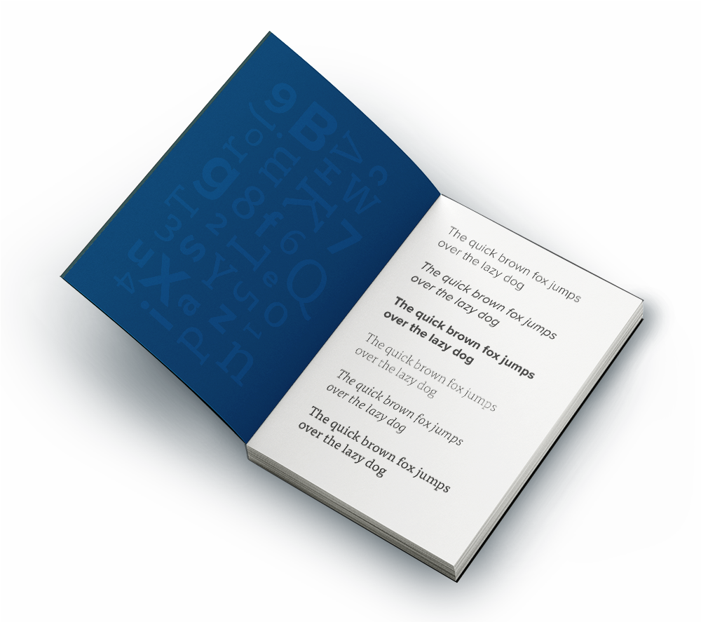
Styles for print:

Styles for web & apps:
Proxima Nova Light
Proxima Nova Regular
Proxima Nova Italic
Proxima Nova Semibold
Proxima Nova Bold
We do not use the Extra Bold or Black font weights.

Hover over the dots to preview different weights.
Tap the dots to preview different weights.
Headline Typeface

To add personality to our products, we can use Tisa Pro in headlines. Please be careful not to overuse, and always pair Tisa Pro with our primary typeface Proxima Nova.

We do not use the Bold, Extra Bold or Black font weights. We do not use Tisa on websites.
Try it out!
Give our font pairing a try by typing out your text in the box below.
