Icons
Our icons are a crucial part of our design system and product experience. Icons support our content and bring visual appeal to our messaging. By adhering to our brand icon style, we also help build a consistent brand experience.
Descriptive Icons
To support content and bring visual appeal to our messaging, we use descriptive brand icons. Icons can be placed inside a circle using navy and white backgrounds and delicate borders.
Our icons fall under the following categories:


Icon Colors & Use Case
We use three different icon art styles depending on use case.
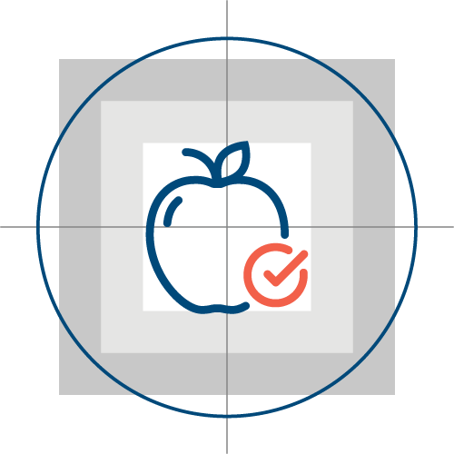
Examples of Navy & Coral Icons


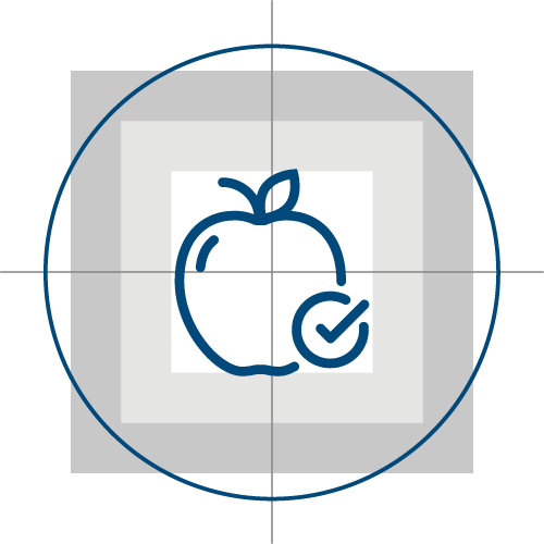
Examples of Navy icons


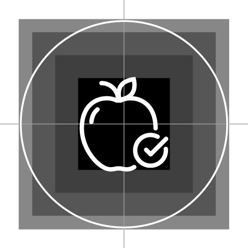
Examples of reversed icons


The download link will open up a folder with several file formats and colors. Here are some tips to help you choose which file to use:
- Always use the SVG file format, unless you're using it in software that doesn't support SVGs. SVG is a vector-based file, which means it can be scaled up without losing any quality. If you try to scale up a PNG or a JPG file, it will look pixelated. SVGs will remain crisp and beautiful in any size.
- If you are placing the icon on a white or a light background, use the Navy & Coral or Navy color version.
- If you are placing the icon on a dark background, use the Reversed color version.
Animated Icons
Animated icons in digital products such as UI and presentations are proven to grab the viewer's attention and bring delight. We encourage the use of animated icons whenever suitable. Be careful not to overuse animated icons on a page, because that may lead to overwhelm and be distracting.
Examples of animated icons
Creating New Icons
Use the following attributes when designing new icons:
Grid size: 55px by 55px
Design area: 36px by 36px
Stroke weight: 1.125pt
Stroke cap and corner: Round
Always create reversed and Navy Blue icons, as well.
Icons created using the icon grid template
Supporting Icons for Web
Action icons symbolize common actions, files, devices, and directories. They are designed to be simple, modern, friendly, and sometimes quirky. Each icon is reduced to its minimal form, expressing essential characteristics.
Icon Library
We use the open source icon library developed by Material, a design system created by Google. The style ‘Rounded’ fits our brand the best. When sourcing a new icon, looking at the Material icon library should be the first step. There are thousands of icons in several categories. The icons can be downloaded as svg (preferred) or png.
Icons can be used in the following sizes:
Should you need a bigger icon, please use a descriptive icon instead.
Examples of supporting icons for web


